The virtue of simplicity
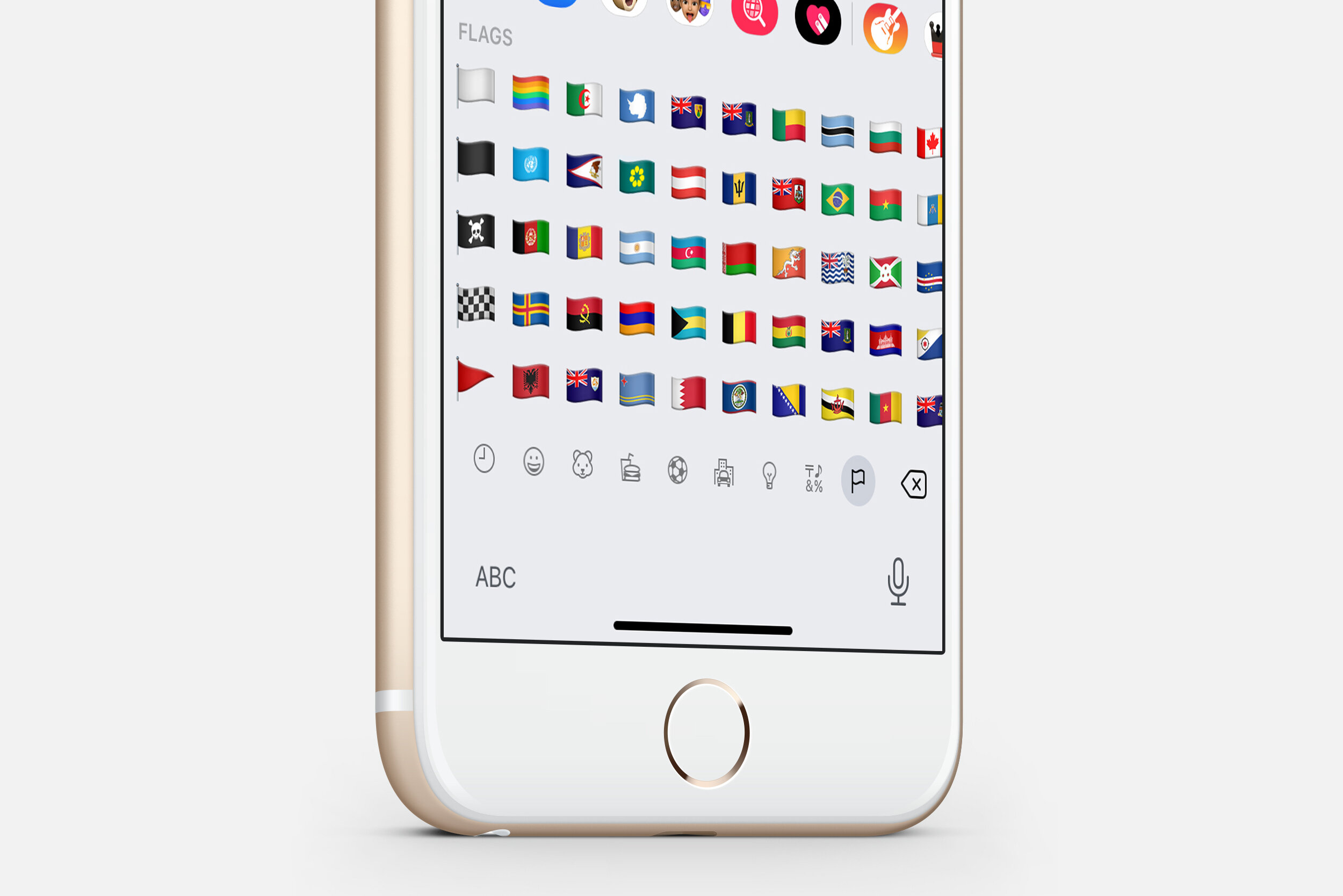
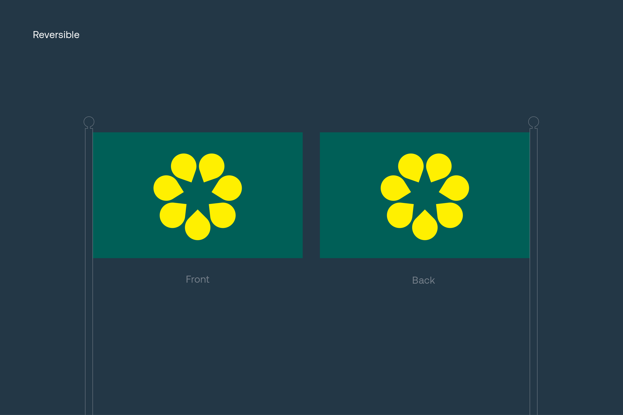
Flags flap. Flags drape. Flags must be seen from a distance and from their opposite side,³ or remain legible as a small on-screen icon. Under these circumstances, only simple designs make effective flags.
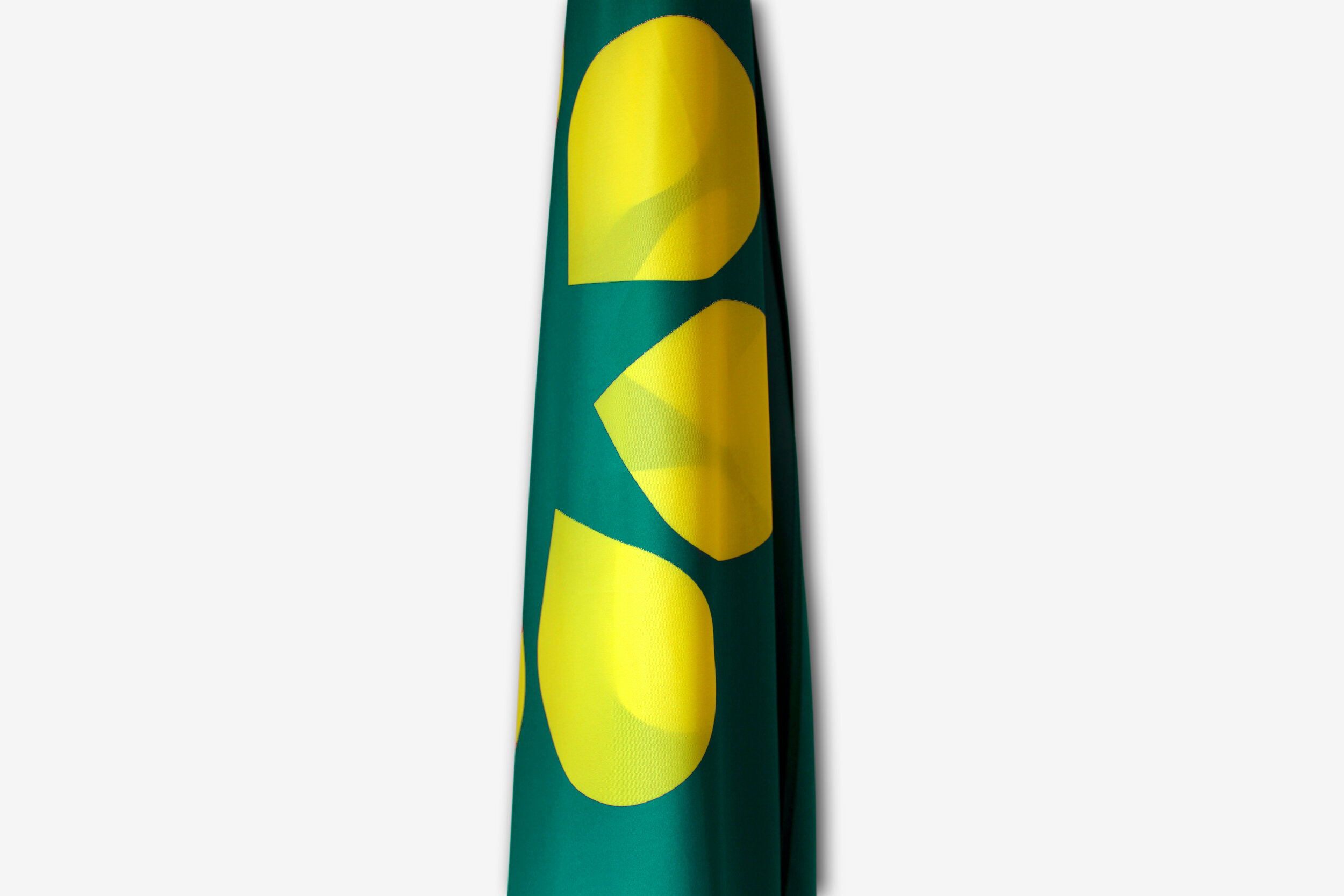
The Golden Wattle flag has the virtue of simplicity; it focuses on a single symbol, made of large shapes and two bold colours. The wattle star emblem remains legible when small or when reversed, as both sides of the flag are identical. It also creates a distinct graphic when furled.
Learn more:
Good Flag, Bad Flag
Ted Kaye, North American Vexillological Association
Design specifications
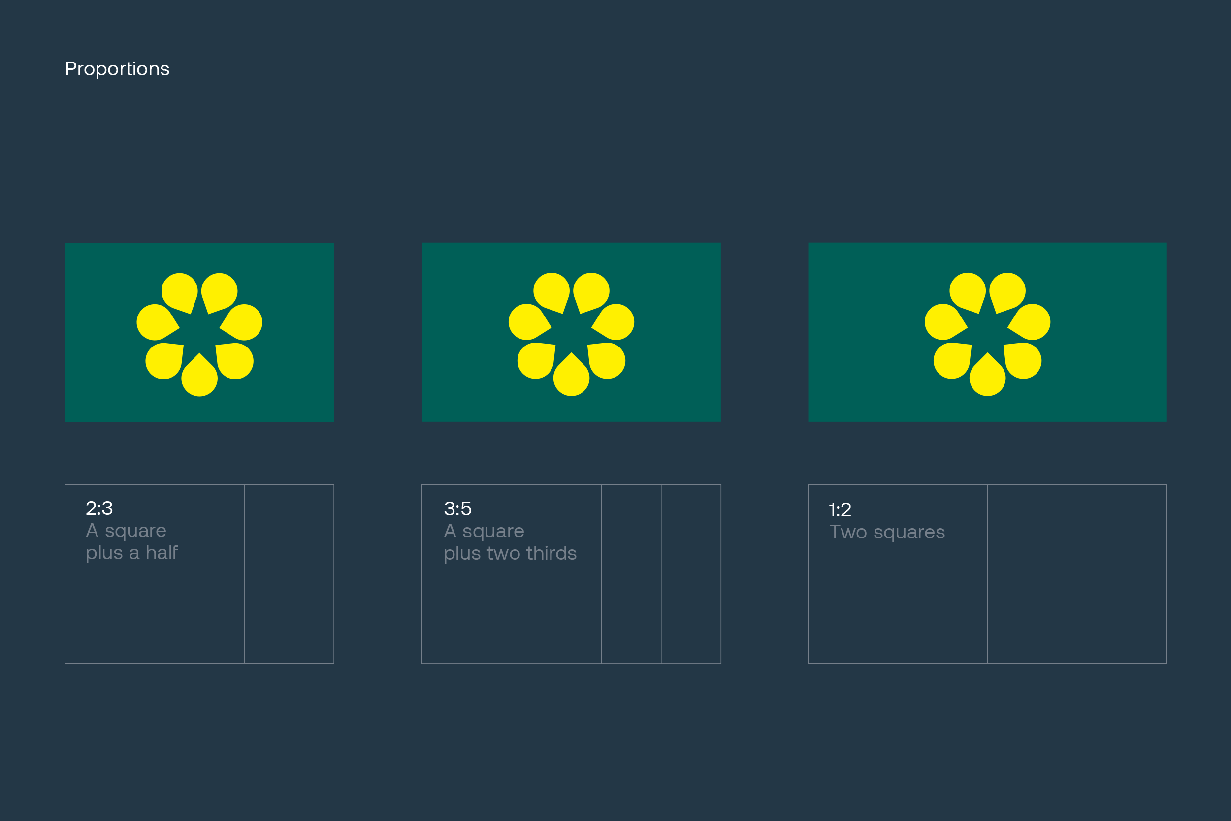
The preferred ratio of the Golden Wattle flag is 3:5, although the flag can also be proportioned to a ratio 2:3 and 1:2 if required. The wattle emblem is positioned at the exact centre and is 5/7ths of the height of the flag.

